Web Design
Case Study
Organization: Arizona State University
Timeline: 2023-Present
Role: Web Designer & UX Strategist
Platforms: CMS · Copywriting · SEO · Accessibility
Objective
Modernize the school’s website to improve usability, visual consistency, and clarity across key pages, while aligning the site with updated branding and communications goals.
Strategy
User-first design: Simplified layouts, improved hierarchy, and clarified navigation to help users find information faster.
Brand alignment: Updated page designs to reflect the school’s rebrand and evolving tone — professional, approachable, and human.
Content clarity: Rewrote and reorganized copy to reduce clutter and highlight key actions and messages.
Consistency at scale: Ensured design patterns, typography, and CTAs were consistent across pages.
Execution
Audited existing webpages to identify outdated content and unclear user paths
Simplified page layouts to prioritize key information and calls to action
Updated content structure to support social and email traffic
Ensured visual consistency and accessibility across redesigned pages
Results
Redesigned nearly all webpages to improve usability and visual consistency
Clearer navigation and stronger content hierarchy across the site
Improved alignment between webpages and active campaigns
More intuitive pathways guiding users toward key actions
Scope
Redesigned nearly all core webpages, including high-traffic and high-impact pages, to create a more cohesive, intuitive user experience.
Website Design Examples
Example Before and After - Alumni Webpage
Before
The alumni network page was text-heavy and hard to navigate, making it difficult for users to understand how to join or engage.
Key benefits and opportunities for alumni were buried in paragraphs, limiting visibility and interest.
Calls to action were inconsistent or missing, reducing conversion and engagement.


After
Redesigned page with clear sections and visual hierarchy to guide alumni through benefits, events, and joining steps.
Highlights and key actions are immediately visible, using headings, bullet points, and modular content blocks.
Strong CTAs encourage sign-ups, newsletter subscriptions, and event participation, improving engagement.
Overall design is clean, approachable, and aligned with the institutional brand.


Challenges
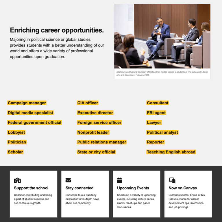
Key content, like student stories and career development resources, was hard to find, reducing engagement with alumni examples and program highlights.
Page hierarchy didn’t clearly guide students toward opportunities, internships, or calls to action.
Visual and text elements were inconsistent, making it difficult for users to quickly scan and absorb important information.
Redesign Improvements
Reorganized the homepage to feature student stories, career pathways, and program highlights front and center.
Created clear visual sections and headings to guide users toward exploring internships, events, and advising resources.
Added consistent CTAs directing students to connect with program advisors or learn more about career development opportunities.
Streamlined the design for readability, accessibility, and stronger engagement with content that matters most to students.

